|
|
Post by sc00ts on Nov 30, 2005 10:11:32 GMT -5
www.myspace.com/warbringerthese guys asked me to do some art, what do you guys think? sounds kind of like a sloppier exodus to me.
|
|
|
|
Post by Hell Bent For Karate Mullets on Nov 30, 2005 13:37:18 GMT -5
What the hell do they want you to draw? A big snare drum? Christ almighty!
EDIT: The material is pretty weak, by the way. Vocals remind of Tom Araya and Billy Milano's love child (birthed by Milano, of course).
|
|
|
|
Post by sc00ts on Nov 30, 2005 14:21:07 GMT -5
they're only demo songs chief
|
|
|
|
Post by Hell Bent For Karate Mullets on Nov 30, 2005 14:39:08 GMT -5
The material is pretty weak, by the way. Vocals remind of Tom Araya and Billy Milano's love child (birthed by Milano, of course). |
|
|
|
Post by funkenstein on Nov 30, 2005 19:44:19 GMT -5
Kinda poopy and weaksauce.
|
|
|
|
Post by sc00ts on Jan 5, 2006 11:47:13 GMT -5
oh yeah, so i did the art, here it is:  i drew it actual size (5" x 5") so it only took me a minute (comparitively), and i got paid for it yesterday. booyah. |
|
DerekRIHC
Stabsgefreiter
 Pizza Thrash
Posts: 453
|
Post by DerekRIHC on Jan 5, 2006 12:11:12 GMT -5
fuck yeah. you need a myspace page dude.
|
|
|
|
Post by sc00ts on Jan 5, 2006 12:28:45 GMT -5
fuck myspace, i have a real website
|
|
|
|
Post by Follow The Hollow on Jan 5, 2006 13:30:24 GMT -5
Thats some good artwork man. I particularly enjoyed the huge goat with the cock and balls hanging out.
Nice touch.
|
|
|
|
Post by sc00ts on Jan 5, 2006 13:41:48 GMT -5
i wanted the goat to be fat instead of muscular but the client over ruled me : /
thanks man
|
|
|
|
Post by Hell Bent For Karate Mullets on Jan 6, 2006 12:13:02 GMT -5
I'm going to have to agree with the client on that one. The well-endowed goat pic is my favorite of the bunch.
The new one sucks. The sword handle doesn't even line-up with the hilt. Your vision of flesh and bone is too clear and crisp. The axe is clearly metal but shaded and chipped like rock. Your corner pin-up facial features are getting repetitive. The background skull design is pathetically sloppy. And most importantly...I'm just giving you shit. Nice job as always.
|
|
|
|
Post by sc00ts on Jan 6, 2006 12:14:30 GMT -5
: (
|
|
|
|
Post by sc00ts on Jan 6, 2006 12:17:38 GMT -5
i'd actually be psyched to get some real criticism.
like i'll freely admit this pic is pure cheese, but these guys had no ideas of their own so i just threw some cliche shit together and they dug it. i really wanted the goat demon to be fat and repulsive instead of "badass". i still like the picture, but whatev.
|
|
|
|
Post by Follow The Hollow on Jan 6, 2006 15:40:05 GMT -5
It still beats anything anyone else here could draw... Except maybe thrashed when he's stoned.
|
|
thrashed
Hauptmann
  sucks a mean D
Posts: 1,524
|
Post by thrashed on Jan 6, 2006 16:43:01 GMT -5
Trust me, I've never drawn anything 1/1000000000000000000000 as good as that. scoots could draw better than me if he was blindfolded, drunk, and had his good arm tied behind his back. I will upload a pic I drew in a few minutes...  click to enlarge this beautiful drawing! |
|
|
|
Post by Follow The Hollow on Jan 6, 2006 20:10:40 GMT -5
Yeah. So I take my last comment back.
|
|
|
|
Post by Follow The Hollow on Jan 9, 2006 19:17:16 GMT -5
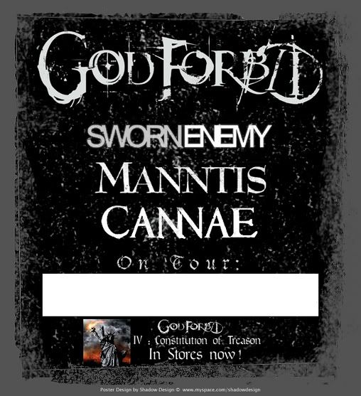
I dont think anyone else here can draw. All I ever do is use photoshop. And Im not even too good at that. Its not like I have talent... I did this for the God Forbid street team.  In case youre wondering, the blank spot is for the street team to write the date/location, etc. |
|
|
|
Post by Follow The Hollow on Jan 9, 2006 21:23:45 GMT -5
It actually ended up getting me two guest list tickets for a God Forbid show near me.
|
|
|
|
Post by Shevy on Jan 18, 2006 8:18:44 GMT -5
Dude, there's nothing wrong with that poster. Simple and easy to read. I hate the artsy fartsy stuff with shit going everywhere. Save your artistic visions for the show and just worry about telling people where to find it on the posters.
|
|